.jpg)
How to Improve Conversion Rates: A Practical Guide
- Mike Dodgson

- Aug 27, 2025
- 18 min read
Improving your website's conversion rates comes down to a simple idea: figure out what your users are trying to do, and then get rid of whatever is stopping them. It's about finding out why people are leaving without taking action and then making smart, systematic changes based on what the data tells you, not just what you think will work.
The first move is to take a hard look at your existing performance to pinpoint the weak spots in your conversion funnel.
Diagnosing Your Website's Conversion Health
Before you think about tweaking a headline or changing a button colour, you need to know where you stand. Making adjustments without establishing a clear baseline is like trying to find your way in a new city without a map – you might get lucky, but you'll probably just end up lost. You need a complete picture of your current performance to see if any of your future changes actually make a difference. This initial diagnosis is what turns guesswork into a genuine strategy.
The very first thing to do is calculate your current conversion rate. This is the percentage of visitors who complete a goal you’ve set—like buying a product or filling out a form—out of your total number of visitors.
For instance, if your landing page gets 2,000 visitors a month and 40 of them sign up for your newsletter (your goal), your conversion rate is 2%. Simple as that: (40 conversions / 2,000 visitors) * 100 = 2%.
Knowing this number gives you a solid benchmark. Now, you have a score to beat.
Finding Where Users Leave Your Website
Your website's analytics platform is your best friend here. Go into your data and hunt for pages with unusually high exit rates. The exit rate tells you the percentage of visitors who left your entire site from that specific page. While every page will have people leaving from it, some pages are far more critical than others.
A high exit rate on a random blog post? Probably not a big deal. But a high exit rate on your checkout page or your pricing table? That’s a massive red flag. These are the exact spots where genuinely interested people are giving up right before they convert.
Your mission is to identify these "leaky" pages in your funnel. In my experience, the usual suspects are:
Product Pages: Are the product details confusing? Are the images low-quality or uninspiring?
Shopping Basket Page: Are people getting hit with unexpected shipping costs? Is the checkout process a pain to navigate?
Contact Forms: Is your form ridiculously long? Are you asking for too much personal info right off the bat?
Once you have a list of these underperforming pages, you can start digging into the why. This is where you move beyond looking at numbers on a screen and start trying to understand actual human behaviour.
Understanding Real User Behaviour
Analytics tell you what's happening, but they don't always tell you why. That's where tools that show you real user interactions, like heatmaps and session recordings, come in. They give you visual proof of how people are actually engaging with your website.
Heatmaps are brilliant. They create a visual overlay on your page, showing you where people click, where they move their mouse, and how far down the page they bother to scroll. A heatmap might show you that everyone's clicking on a fancy image that isn't actually a link, which points to a clear design flaw. Or it might reveal that almost no one is scrolling far enough to even see your main call-to-action button.
Session recordings go a step further. These are literal video recordings of real user visits, letting you watch over someone's shoulder as they navigate your site, get stuck, and eventually leave. I can't tell you how many "aha!" moments I've had from watching just a handful of these recordings for a page with a high exit rate. You might see someone desperately trying to click a broken button or struggling to read tiny text on their mobile. It’s incredibly insightful.
Setting Realistic Improvement Targets
Take a moment to see how your conversion rates stack up against industry benchmarks. This gives you some much-needed context. For example, an average blog conversion rate might hover around 1-2%, while e-commerce sites often sit between 2-3%. If you're well below your industry's average, that's not a reason to panic—it's a clear sign there's plenty of room to grow.
Just be realistic with your goals. Aiming for a small, steady increase—like trying to get from 1.5% to 2%—is a much smarter and more achievable goal than trying to double your conversion rate overnight. This whole diagnostic process gives you a clear, data-backed starting line for the real work ahead.
Building Unshakable Trust with Your Audience

Before a visitor will think about parting with their money or personal details, they need to feel certain you’re a legitimate, reliable business. Trust isn't just a bonus; it's the bedrock of conversion. Every single element on your page is either building that confidence or slowly chipping away at it.
People are hardwired to look for signals that they’re making a safe bet. A site that lacks these cues feels risky, causing visitors to hesitate and, more often than not, just leave. Your job is to answer their unspoken questions and calm their doubts before they even fully materialise.
Showcase Genuine Social Proof
I’ve seen it time and time again: nothing builds confidence faster than seeing that other people have already had a great experience with you. This is the magic of social proof, and it’s one of the most direct ways to prove you’re the real deal. Displaying positive feedback from past customers can have a huge impact on your conversion rates.
You’ve got a few solid options for putting this proof to work:
Customer Reviews: Don’t be afraid to feature authentic, unedited reviews. Simple star ratings and short, punchy quotes are incredibly effective, especially on product and service pages.
Detailed Testimonials: A simple quote is good, but a testimonial with a customer’s full name, company, and a photo? That’s gold. It feels so much more credible.
Case Studies: If you offer more complex services, a case study is the perfect way to show real-world results. Walk people through the problem you solved and the specific, positive outcome you delivered.
Just make certain you place these elements where they'll have the most impact—right next to your call-to-action buttons, on checkout pages, or just below your main service description. Visibility at the moment of decision is everything.
A key takeaway is that strategic placement can make all the difference. I've seen a well-placed testimonial on a checkout page be the final nudge a hesitant customer needed to click "buy".
If you want to go deeper into the fundamentals of building a site that converts, our 2025 guide to conversion optimisation basics for business growth is a great place to start.
Display Clear Trust Signals
Beyond what your customers are saying, you can use universally recognised symbols to signal security and reliability. These are often small visual cues, but they carry a huge psychological punch, especially for first-time visitors who don't know your brand yet.
Think about weaving these trust signals into your design, particularly near any payment or information fields:
Security Seals: Logos from brands like McAfee or Norton instantly tell people the site is scanned and secure from threats.
Payment Logos: Displaying familiar icons like Visa, Mastercard, and PayPal shows you use established and secure payment processors.
Guarantees and Policies: Make your return policy, money-back guarantee, or free shipping info impossible to miss. These promises reduce the perceived risk of making a purchase.
Being completely upfront with this stuff shows you have nothing to hide and that you genuinely stand behind what you’re selling.
Be Transparent and Accessible
Hidden costs and hard-to-find contact details are absolute trust-killers. If you’re serious about improving conversions, transparency is non-negotiable.
Your pricing needs to be completely straightforward. If there are shipping costs or other fees, show them early in the process—don't spring them on someone at the final checkout page. Studies consistently show that unexpected costs are a leading cause of basket abandonment.
Make it incredibly easy for people to get in touch. A visible phone number, a clear email address, or a physical address (for local businesses) shows there are real people behind the website. This accessibility acts as a safety net, reassuring customers that help is there if they need it.
Make Your Website Faster and Easier to Use

Let’s be honest: a visitor’s patience online is wafer-thin. If your website is slow to load or a puzzle to get around, you’re putting up a huge barrier that kills your chances of converting them. People simply won't wait for a sluggish page to appear or try to decipher a confusing layout. They'll just leave.
Sorting out these common frustrations is one of the most powerful things you can do for your conversion rates. A faster, more intuitive website doesn't just feel better to use—it actively encourages people to stick around, explore, and actually do what you want them to do.
Get Serious About Page Speed
Every single second your website takes to load is costing you customers. It’s not a minor inconvenience; it's a major roadblock. We all expect instant results online, and any delay immediately creates frustration and doubt.
This isn’t just a hunch. For UK shoppers, a slow website can slash conversion rates by roughly 0.3% for every extra second of load time. Think about that. Pages that load in under one second can see conversion rates close to 40%, but that figure gets cut in half by the time the load hits five seconds.
The first step is to figure out where you stand. A tool like Google's PageSpeed Insights is perfect for this. It gives you a clear score and a checklist of specific issues you need to tackle.
The report breaks down key metrics like First Contentful Paint and Speed Index, giving you a proper diagnosis of what’s slowing you down.
So, what are the usual suspects? It often comes down to a few technical elements.
Bloated Images: Uncompressed, oversized images are probably the number one cause of slow load times. Before you even upload them, run them through a compression tool. You can easily slash file sizes by over 70% without any noticeable drop in quality.
Browser Caching: This is a simple but effective fix. Caching tells a visitor’s browser to save parts of your site (like your logo and CSS files), so it doesn't have to re-download everything on their next visit. This makes a huge difference for returning users.
Poor Hosting: That cheap shared hosting plan might seem like a bargain, but it can absolutely cripple your site’s performance when traffic picks up. Investing in solid, reliable hosting is a foundational step for a speedy website.
If you want a more detailed walkthrough, our guide on how to improve website speed offers proven ways to boost performance. It breaks these technical fixes down into much more manageable steps.
Create Simple, Obvious Navigation
If someone can't find what they're looking for in a few clicks, they'll assume you don’t have it. A confusing menu is like a badly organised shop—customers get fed up and walk straight out. Your goal here is clarity, not cleverness.
Your main navigation should be simple and predictable. Use plain English, descriptive labels for your menu items. Instead of something vague like "Solutions," be direct with something like "Our SEO Services."
A little test I often recommend is the "five-second rule." Get someone who has never seen your site before and ask them to find a specific product or page. If they can't do it in five seconds, your navigation needs work.
Here’s how to simplify the user's journey:
Follow the Three-Click Rule: Aim to design your site so anyone can get from the homepage to any other important page in three clicks or less. A flatter site structure almost always wins.
Group Things Logically: Organise your pages into categories that make sense to your customers, not just your internal teams.
Make Search Obvious: If you have a lot of content, a prominent search bar is non-negotiable. Make it easy to spot and that it actually returns relevant results.
Nail the Mobile Experience
With more than half of all web traffic coming from mobile devices, a clunky experience on a smartphone is a deal-breaker. You're effectively slamming the door on the majority of your potential customers. A mobile-responsive design isn't just a nice-to-have anymore; it's a core requirement.
And it goes beyond just having a site that shrinks to fit a smaller screen. A truly mobile-friendly experience considers how people actually use their phones. Buttons need to be big enough to tap, text has to be readable without pinching to zoom, and forms should be a breeze to fill out on a tiny keyboard.
The best way to check this is to test it yourself. Grab your phone and go through your entire conversion process, from landing on your site to buying a product or filling out a form. Every single point of friction you find is a leak in your conversion funnel that needs plugging.
Refining Your Calls to Action and Forms
Think of your call-to-action (CTA) buttons and contact forms as the final handshake. They are the gateways to a conversion. After all the effort you’ve poured into getting someone to your site and convincing them you’re the right choice, a clunky button or a complicated form can stop a potential customer dead in their tracks.
The path to better conversion rates is often paved with simplicity. Making these last steps as clear and easy as possible is a non-negotiable. This means scrutinising everything from the colour of your buttons to the number of fields in your sign-up form.
Writing CTA Text That Prompts Action
The words you use on your CTA button really matter. Generic phrases like “Submit” or “Click Here” are just wasted space. Your button text needs to be specific, telling the user exactly what value they’ll get by clicking it.
Forget vague commands. Instead, try using action-oriented language that completes the sentence "I want to...".
Instead of: "Submit"
Try: "Get My Free Quote"
Instead of: "Download"
Try: "Download the E-book"
It’s a subtle shift, but it makes the outcome tangible and speaks directly to what the user wants to achieve. You’re not just asking them to hand over their details; you’re offering a solution. This clarity cuts through any hesitation.
Designing Buttons That Stand Out
For a button to get clicked, it has to be seen. The design of your CTA—its colour, size, and placement—is a huge factor in whether it gets noticed. The goal is to create visual prominence without making your page look like a mess.
A simple but incredibly effective trick is to use a contrasting colour. If your website mainly uses a blue and white colour scheme, a bright orange or green button will naturally draw the eye. It doesn't need to be garish; it just needs to be different enough to pop.
One of the most common mistakes I see is when CTAs are designed to blend in with the brand's colour palette. It might look neat and tidy, but it can make the button almost invisible. The single most important action on the page should be the most obvious one.
Size and placement are also critical. Your button should be big enough to be easily tapped on a mobile, but not so enormous that it feels aggressive. Placing CTAs "above the fold" (where they’re visible without scrolling) is a classic move for a reason, but don’t forget to place them after key sections of content, right at the moment a user might be ready to make a decision.
For more ideas on how to lift your sales, you can read our guide on expert e-commerce conversion rate optimisation.
Simplifying Your Forms for More Completions
Nothing kills a conversion faster than a long, intimidating form. In fact, research shows that as many as 27% of users will abandon a form if it's too long or asks for too much. Your goal here should be ruthless simplification: ask for the absolute minimum information you need to move forward.
Go through every single field on your forms and ask yourself, "Do I really need this information right now?" For a newsletter sign-up, an email address is all you need. For an initial enquiry, a name, email, and a message box usually does the trick. You can always gather more details later on as you build the relationship.
Here’s a quick look at a high-friction versus a low-friction approach:
High-Friction Form Field | Low-Friction Alternative | Why It Works Better |
|---|---|---|
First Name & Last Name | Full Name | Combines two fields into one, making the form feel shorter. |
Asking for a Phone Number | Make it an optional field | Reduces anxiety about receiving unwanted sales calls. |
Complex Password Rules | Use a simple progress bar/checklist | Provides clear guidance instead of frustrating error messages. |
Make certain your forms are actually easy to use. Use clear, simple labels for each field and provide helpful, real-time error messages if someone makes a mistake. For instance, if an email address is formatted incorrectly, highlight the field in red and give a simple instruction like, "Please enter a valid email address." This immediate feedback prevents frustration and helps guide the user towards a successful submission.
Using A/B Testing to Find What Really Works
Making changes to your website based on a gut feeling is a recipe for disaster. What seems like a genius design tweak in a team meeting could send your conversion rates plummeting. This is exactly why a systematic, data-led approach is non-negotiable—it takes the guesswork out of the equation and lets your audience's actual behaviour guide your decisions.
Instead of assuming you know what your users want, you test it.
A/B testing, or split testing, is a beautifully simple concept. It involves comparing two versions of a webpage to see which one performs better. You show version 'A' (the control) to one half of your visitors and version 'B' (the variation) to the other. By measuring how each group responds, you get hard evidence about what actually drives conversions.
It All Starts With a Solid Hypothesis
Every worthwhile test begins with a clear idea of what you’re trying to achieve. This is your hypothesis—an educated guess about what change will produce a better result. A strong hypothesis isn’t just a random thought; it’s born from the insights you've already gathered from your site audit, heatmaps, and customer feedback.
Let's say you've watched session recordings and noticed users hovering over your "Submit" button without clicking. A good hypothesis might be:
"I believe that changing the button text from the generic 'Submit' to the more specific 'Get Your Free Audit' will increase form completions because it clearly communicates the immediate value for the user."
See how that works? It’s specific, measurable, and tied directly to a business goal. You now have a clear question that your test can answer.
The process is a continuous loop: you measure, analyse, test, and then monitor the impact of your changes, as shown below.
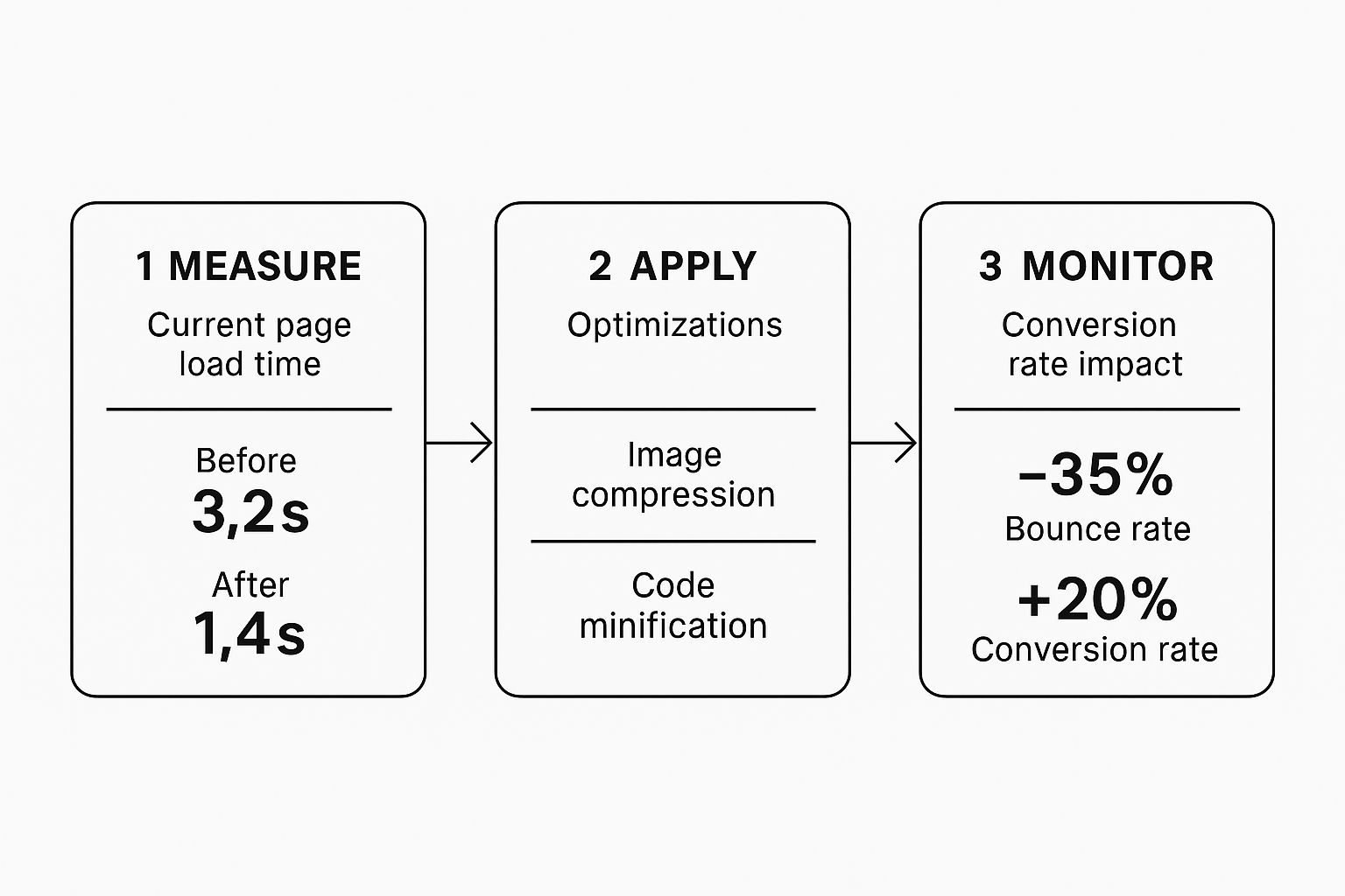
This visual really hammers home how applying focused improvements leads to genuine gains, not just in user experience but in your bottom-line conversion numbers.
Run a Clean, Controlled Test
Once you have your hypothesis, it's time to set up the A/B test. The golden rule here is to isolate a single variable. If you change the headline, the button colour, and the main image all at once, you’ll have no idea which change actually made the difference. For clean, reliable data, test one thing at a time.
Here are a few classic elements to start testing:
Headlines and Subheadings: Does a benefit-driven headline beat one that asks a question?
Call-to-Action (CTA) Text: Which phrase creates more urgency or clarity? "Shop Now" vs. "Explore the Collection."
Images and Videos: Does a short product demo video convert better than a static image?
Page Layout: Would moving your lead-gen form above the fold increase submissions?
You need to let the test run long enough to gather a statistically significant amount of data. Pulling the plug too early based on a few initial conversions can give you a false positive. Most testing tools, like VWO or Optimizely, will tell you when you have enough data to declare a winner with confidence. Building a consistent testing culture is crucial, and our guide on SEO conversion optimisation strategies offers more on this.
UK Traffic Source Conversion Benchmarks
Not all traffic is created equal. Knowing where your most valuable visitors come from helps you prioritise your improvement efforts. For example, if you know organic search visitors convert well, you can focus on improving the landing pages they arrive on. This table gives you a rough idea of what to expect in the UK market.
Traffic Source | Average Conversion Rate (UK) | Sector-Specific Example |
|---|---|---|
Referral (e.g., from a trusted blog) | 3% - 5% | A UK financial services firm gets high-quality leads from a MoneySavingExpert feature. |
Organic Search | 2.5% - 4% | A fashion retailer sees strong sales from users searching for "linen summer dresses UK". |
Paid Search (PPC) | 2% - 3.5% | A SaaS company converts users searching for "best project management software for small business". |
Email Marketing | 2% - 3% | An online bookstore drives sales from a newsletter promoting a 'Book of the Month' offer. |
Social Media (Organic & Paid) | 0.5% - 1.5% | A B2C brand converts Instagram users who click on a limited-time offer in their Stories. |
Use these benchmarks as a starting point. If your paid search conversion rate is languishing at 0.8%, you know there's a significant opportunity for improvement right there.
What Do the Results Mean?
Once the test concludes, you get to the exciting part: analysing the numbers. The winning variation is simply the one that generated a higher conversion rate with statistical confidence. If your 'B' version was the clear winner, you can confidently roll that change out across your site.
Sometimes, a test will be inconclusive, with neither version showing a real advantage. That’s still a win! It tells you the element you tested isn't a major conversion driver for your audience, allowing you to move on to the next hypothesis.
This iterative process creates a powerful cycle of continuous improvement, where every single decision is backed by the behaviour of real people.
Where Are Your Best Customers Coming From?

It’s easy to assume every visitor to your site is created equal, but that’s rarely the case. Someone who finds you through a trusted industry blog is in a completely different headspace than someone who just clicked a paid search ad for a specific product. This is where digging into your traffic sources becomes a game-changer.
By breaking down your conversions by channel—be it organic search, paid ads, social media, or direct visits—you start to see a clear picture. The goal isn't just to find out which channel sends the most traffic, but which one sends the best traffic. The kind that actually converts.
Match Your Message to Their Mindset
Once you've identified where your high-value visitors are coming from, you can start shaping their journey from the very first click. Think about it: a user who clicks a Google Ad for "emergency plumbing services" is in a hurry and needs to see a page that immediately builds trust and provides an obvious way to make contact.
On the other hand, if someone clicks through from an email newsletter about your "Summer Sale," they expect to land on a page filled with those exact sale items. When there's a disconnect between the promise of the link and the reality of the landing page, you get high bounce rates and lost opportunities.
Looking at UK-specific data, it’s clear that tailoring your approach pays off. Recent figures show direct traffic—people typing your URL straight into their browser—boasts the highest conversion rates, hitting an average of 3.3%. These are often your most loyal customers. Paid search follows closely behind at around 3.2%, though this can fluctuate wildly depending on the industry. If you want to go deeper into these numbers, you can find more insights about UK conversion rates here.
Building Custom Paths for Different Audiences
A great way to put this into practice is by creating distinct landing pages or user flows for your key traffic segments. It's a bit more work, but the payoff is huge.
For Paid Search: Send them to a stripped-back landing page. The page should have one clear call to action that directly reflects the ad they just clicked. Ditch the main navigation and anything else that might distract them.
For Social Media: These visitors are often browsing, not buying. Guide them to something more engaging, like a compelling blog post or a gallery of user-generated content. Build the relationship first.
For Email Subscribers: These people already know you. Direct them straight to exclusive offers or new product drops that reward their loyalty and acknowledge that existing connection.
By tailoring the experience based on where the visitor came from, you’re creating a much more relevant and persuasive journey. Simply meeting their expectations head-on can give your conversion rates a serious lift across the board.
This isn’t about a one-size-fits-all website. It's about building a smarter, more personalised experience that speaks directly to what each user needs, right when they need it.
Your Top Conversion Questions, Answered
When you start digging into conversion improvement, a few common questions always seem to pop up. Let's tackle them head-on, drawing from years of experience helping businesses figure this stuff out.
What’s a “Good” Conversion Rate, Really?
Honestly, a "good" conversion rate is a bit of a moving target. It changes massively depending on your industry, what you're selling, and even your price point.
For a UK e-commerce site, you might see anything between 2% to 4% as a solid baseline. If you're in B2B services, generating leads, that number might look more like 1% to 3%. But these are just averages.
The only number that truly matters is your own. The most useful benchmark is your past performance. Your goal should be to beat your last month's or last quarter's rate.
Don't get hung up on chasing an abstract industry average. The real win is consistently improving your own numbers and turning more of your hard-won traffic into actual customers. That's progress.
How Long Should I Run an A/B Test?
This is a big one, and getting it wrong can completely invalidate your results. The biggest mistake I see is people calling a test too early when one variation gets a quick lead. Patience is key here.
You need to run a test long enough to reach statistical significance—that’s the point where you can be confident the results aren't just a fluke. Most A/B testing platforms, like VWO or Optimizely, will tell you when you hit a 95% confidence level.
As a rule of thumb, always let a test run for at least one full business cycle. For most businesses, that means a minimum of one full week to smooth out the typical peaks and troughs in traffic from Monday to Sunday.
I Don't Know Where to Start. What Should I Optimise First?
Feeling a bit overwhelmed? That’s normal. The best way to cut through the noise is to focus on the pages with the biggest potential impact on your revenue. Don't waste time tweaking a page that gets hardly any visitors.
Start with your heavy hitters:
Your highest-traffic product or service pages
Your shopping cart and checkout process
Even a tiny lift in conversions on these critical pages will deliver a far greater return than a massive improvement on a forgotten blog post. Go into your analytics, find the biggest drop-off points in your customer journey, and point your efforts there first.
Ready to turn more of your organic traffic into real leads and revenue? Digital Sprout offers specialist freelance SEO consultancy that focuses on driving measurable growth for ambitious businesses. Let’s build a strategy that gets results.
Find out more at https://www.digital-sprout.co.uk.