.jpg)
Boost Sales with Expert E-commerce Conversion Rate Optimization
- Mike Dodgson

- Aug 22, 2025
- 16 min read
What exactly is e-commerce conversion rate optimisation? It's the art and science of fine-tuning your online shop to encourage more visitors to buy something. It is about studying user behaviour and methodically testing changes—from your product pages right through to the final checkout—to turn browsers into buyers.
Setting a Smart Baseline for Your CRO Efforts

Before you touch a single button or rewrite a line of copy, you must get a clear picture of how your shop is performing right now. Trying to make improvements without this baseline is like trying to find your way around a new city without a map—you will be moving, but you will have no idea if you are getting any closer to your destination. A proper site audit gives you that fact-backed foundation for every decision you make.
This initial analysis is not just about collecting numbers; it is about seeing them as clues. Each metric tells a story about your customer's journey, revealing where they get excited and where they get stuck. By understanding these patterns, you can pinpoint the weak spots and focus your energy where it will make the biggest difference. To get the full picture, explore the essential strategies for website conversion rate optimization that can transform your business.
Defining Your Key Performance Indicators
First, you need to get your analytics platform tracking the metrics that actually matter. It is incredibly easy to get lost in a sea of data, but a handful of key figures will give you a powerful snapshot of your store's health. Think of these as the bedrock of your CRO strategy.
Here is a breakdown of the fundamental metrics you will want to track as you begin your CRO audit. Each one offers a different window into your customers' behaviour and can signal problems that need your attention.
Key Metrics for Your Initial CRO Audit
Metric | What It Measures | What a Poor Result Suggests |
|---|---|---|
Conversion Rate | The percentage of visitors who complete a purchase. | Your overall offer, user experience, or trust signals might be weak. |
Cart Abandonment Rate | The percentage of shoppers who add items to their cart but don't buy. | Hidden costs, a complicated checkout process, or payment issues. |
Average Order Value (AOV) | The average amount spent each time a customer places an order. | A lack of upselling, cross-selling, or product bundling opportunities. |
Bounce Rate | The percentage of visitors who leave after viewing only one page. | Mismatched traffic, a slow-loading page, or a confusing layout. |
Understanding these numbers is the first step, but the real magic happens when you start to connect them to the real-world user experience on your site.
Looking Beyond the Numbers With User Behaviour Tools
The quantitative data from your analytics tells you what is happening, but it rarely explains why. To get the full story, you have to pair this data with qualitative tools that show you how real people are interacting with your shop. This is how you get inside your customers' heads.
Heatmaps are a fantastic starting point. They give you a visual map of where users click, move their mouse, and scroll. This can instantly show you if your main call-to-action buttons are being ignored or if people are trying to click on things that are not links.
Session recordings take it a step further, giving you video-like playbacks of individual user visits. Watching these can be a real eye-opener, revealing moments of frustration or confusion that would go unnoticed. You might see someone struggling with your navigation menu or abandoning their cart because they cannot find the delivery information.
By combining analytics data with user behaviour insights, you move from making assumptions to making informed decisions. This evidence-backed approach is the core of successful conversion rate improvement.
In the competitive UK e-commerce market, this analytical approach is especially important. With an average UK e-commerce conversion rate hovering around 3.4% and a market projected to hit over £128.8 billion in 2025, even small tweaks can lead to huge returns.
Around 70% of online orders in the UK were made via mobile in 2023. That single statistic makes a powerful case for prioritising mobile usability and site speed. This solid foundation of data and user insight is what prepares you to make changes that genuinely affect performance.
Designing Product Pages That Actually Convert
Think of your product pages as your digital shop floor. This is the moment of truth, where a casual browser decides whether to become a customer. A great product page does more than just list an item; it anticipates questions, builds confidence, and gently nudges the visitor towards the checkout.
Every single element here plays a part in telling your product's story. From the quality of your images to the clarity of your shipping policy, each detail can either encourage a sale or cause that person to hesitate and click away. Nailing these components is the foundation of any solid e-commerce conversion strategy.
Show, Don’t Just Tell with High-Quality Visuals
In an online store, your customers cannot pick up or feel your products. That means your imagery has to do all the heavy lifting, bridging that gap between the digital and the physical. Grainy, low-resolution photos are an instant turn-off and can make even a premium product look cheap.
I always advise clients to invest in professional photography that captures their products from every angle. Make sure you have a zoom function to show off the fine details, and if you can, include lifestyle shots that place the item in a real-world context. This helps shoppers visualise themselves using it, making the decision to buy that much easier.
A video demonstration can be even more powerful. For a piece of clothing, a quick video showing how the fabric moves is incredibly persuasive. For a new gadget, a short clip demonstrating its main feature can answer a dozen questions in just a few seconds.
Write Product Descriptions That Resonate
A great product description sells a solution, not just a list of features. Instead of simply stating what your product is, you need to explain what it does for the customer. Focus on the benefits—how it solves their problem or makes their life better.
Keep the language clear and concise. Break up chunks of text with bullet points to make the key details easy to scan. A winning description should always:
Answer key questions before the shopper even thinks to ask.
Use sensory words that help the customer imagine holding or using the product.
Tell a mini-story about where it came from or its ideal use.
It is also important to understand the unique challenges of your market. UK industry-specific conversion rates show just how much consumer behaviour can differ. For instance, fashion retail hovers around a 1.9% conversion rate, often plagued by high cart abandonment. This tells us that compelling descriptions and crystal-clear sizing guides are non-negotiable.
The electronics sector enjoys a healthier 3.6% rate but often struggles with returns. This puts the pressure on having incredibly detailed specifications and transparent feature explanations. Getting to grips with these subtleties is a huge part of a smart approach to e-commerce conversion rate optimization.
Think of your product description as a helpful shop assistant, not a technical manual. It's a conversation that answers questions and builds genuine excitement.
Make Your Call-to-Action Impossible to Miss
That "Add to Cart" or "Buy Now" button is the single most important click on your entire product page. You would be amazed at how much its design and placement can affect your sales. The button needs to pop visually, usually with a contrasting colour, and it must be placed prominently "above the fold" where no one can miss it.
The wording matters, too. "Add to Cart" is the standard, but it is worth testing variations like "Add to Bag" or more direct commands like "Get It Now." Your goal is to make the next step completely obvious and effortless. You can find out more about crafting content that converts by exploring our guide on SEO for e-commerce to boost online sales, which shows how page copy ties into your wider search performance.
Do not forget to surround your call-to-action with trust signals. Things like customer reviews, security badges, and clear information about shipping and returns all work together to reduce that last-minute anxiety and make that final click a confident one.
Removing Friction from Your Checkout Process

This is it. The final hurdle. After all your hard work on product pages and site design, the checkout is where a sale is won or lost. I have seen countless businesses lose customers at this last stage simply because the process was clunky, confusing, or full of surprises.
The goal here is simple in theory but requires a bit of finesse in practice: remove every single obstacle. Each field a customer has to fill out, every unexpected cost, and every moment of confusion adds friction. This is all about making that final step the easiest one of their entire journey.
A smooth transaction is the bedrock of good e-commerce conversion. You want customers to feel confident and clear about their purchase, gliding from cart to payment confirmation without a second thought.
Simplify the Path to Purchase
From my experience, the biggest source of friction is almost always asking for too much information. People are short on time and patience. A long, intimidating form is often all it takes for them to abandon their cart and go elsewhere. Your first job is to look at every single field on your checkout page with a critical eye.
For instance, do you really need their phone number? If not, get rid of it. Are you asking for their name twice, once for billing and once for shipping? Make this simpler. Use a simple checkbox to automatically copy the billing details over to the shipping section. Each field you can remove makes the process feel faster and far less intrusive.
Another major roadblock is forcing account creation. While building a customer list is valuable, demanding registration before a purchase can stop up to 23% of potential sales in their tracks.
Offering a prominent guest checkout option is one of the most effective changes you can make. It respects the customer's time and removes a massive barrier, letting them complete their purchase with minimal fuss.
You can always prompt them to create an account after the purchase is complete, using the details they have already provided. This small shift in timing can make a huge difference to your conversion numbers.
Manage Expectations and Build Confidence
Uncertainty is a conversion killer. If a customer does not know how long the checkout will take or what comes next, they get anxious and are more likely to bail. A simple progress bar or step indicator is a brilliant tool for managing these expectations.
Seeing a clear path—something like "Shipping > Payment > Confirmation"—reassures the user that they are nearly finished. It breaks the process into manageable chunks and gives them a sense of control, which is needed for building trust at this stage.
Transparency about costs is just as important. Honestly, there is nothing more frustrating for a shopper than getting to the final payment screen only to be hit with unexpected shipping fees or taxes. In fact, surprise costs are the number one reason for cart abandonment.
Display Shipping Costs Early: Show estimated shipping costs on the product page or right in the cart. Do not make them wait until the very end.
Be Upfront About Taxes: If applicable, make sure VAT or other taxes are clearly itemised and explained.
Offer Clear Choices: If you have multiple delivery options, lay them out clearly with the associated costs and estimated arrival dates.
Being completely transparent builds credibility and stops customers from feeling like they have been misled, which can ruin their experience and lose you a sale for good.
Provide Flexible and Familiar Payment Options
The final piece of the puzzle is the payment itself. A customer who has made it this far is ready to buy, but if they cannot use their preferred payment method, you have lost them. The world of payments is incredibly diverse now, and catering to different preferences is not just a nice-to-have—it is a necessity.
Offering a solid variety of payment options, from major credit cards to digital wallets like PayPal or Apple Pay, covers most bases. This flexibility shows you understand your customers and are making an effort to accommodate them.
Choosing the right payment gateway is a critical decision for your checkout experience. You can learn more about the best payment gateways for small business by looking into things like fees, features, and the overall user experience they provide. By removing these last few obstacles, you create a path of least resistance from interest to purchase, which means more sales and happier customers.
Running a Disciplined A/B Testing Programme
If you want lasting improvements to your conversion rates, you have to stop guessing. Real progress comes from consistent, methodical testing. A disciplined A/B testing programme shifts you away from making changes based on gut feelings and towards a system where every single decision is backed by real user data. Over time, this builds a library of knowledge that makes every future improvement that much smarter.
It all kicks off with a solid hypothesis. Using the data you gathered in your initial audit, you can form an educated guess about what change will lead to a specific, measurable improvement. For example: "Changing the main call-to-action button colour from grey to orange will increase clicks by 10% because it will stand out more against our site's blue background."
You are applying the scientific method to your online shop. You spot a problem, propose a solution, and then test it rigorously to see if you were right. If you are just getting started, you can explore the basics of conversion optimisation in our 2025 guide for business growth to get your bearings.
Choosing What to Test
The list of things you could test is practically endless, which is why prioritisation is key. You can focus on small, isolated elements or go for bigger, more sweeping changes. Low-effort tests on things like headlines or button text can deliver quick insights, while more complex tests on page layouts or pricing models might yield much more substantial results.
Some of the most common areas I see clients focus their testing efforts on include:
Headlines and Subheadings: Does a benefit-led headline work better than a feature-led one? Test different wording to see what grabs attention and communicates your value.
Call-to-Action (CTA) Buttons: Experiment with colour, size, placement, and the text itself. You would be surprised at the difference between "Buy Now" and "Add to Basket."
Product Imagery: How do lifestyle photos perform against clean, studio shots? What about adding a short product video into the mix?
Page Layout: This is a bigger swing, but testing a radical redesign of a key page, like your homepage or product page, can tell you a lot about how a new structure affects user flow.
The image below brings home how the different metrics you are trying to influence with testing all work together.
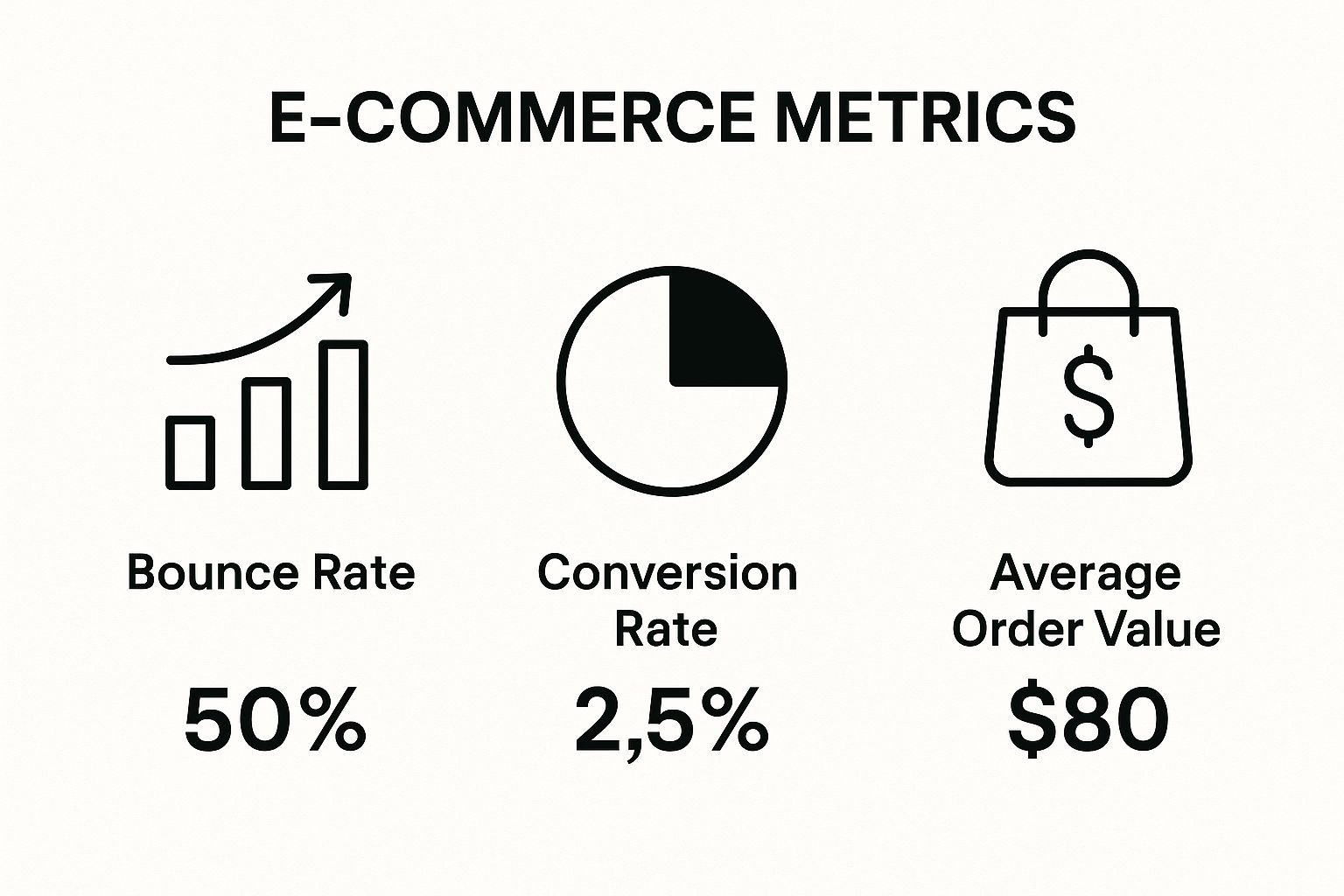
It is a great visual reminder of how even tiny improvements in your conversion rate can have a massive effect on the bottom line when combined with a healthy average order value.
Here are a few ideas to get your own testing programme started, categorised by potential effort and effect.
A/B Testing Ideas for E-commerce Sites
Test Element | Example Variation | Potential Effect Level |
|---|---|---|
CTA Button Text | "Add to Basket" vs. "Buy It Now" | Low to Medium |
Headline Copy | Benefit-focused vs. Feature-focused headline | Low to Medium |
Product Image Style | Studio shots on white vs. In-context lifestyle photos | Medium |
Trust Badges | Adding payment logos (Visa, PayPal) near the checkout button | Medium |
Page Layout | Complete redesign of the product detail page | High |
Pricing Strategy | "£99" vs. "£100" or showing "Pay in 3 instalments" | High |
This table is not exhaustive, but it should give you a sense of the scale. Start with the "low to medium" effect tests to build momentum and get comfortable with the process before tackling the bigger, high-effect experiments.
Understanding Statistical Significance
Running the test is only half the battle. To trust your findings, you have to get your head around statistical significance. It is a measure of how confident you can be that your results were not just a fluke or down to random chance.
Most testing tools like VWO or Optimizely will calculate this for you, and you should always aim for a confidence level of 95% or higher.
Reaching statistical significance means you can be reasonably sure that if you roll out the winning version, it will actually deliver the improvement you saw in the test. Acting on results that are not statistically significant is just a more complicated form of guesswork.
Looking back at the history of e-commerce in the UK, you can see how methodical improvements have paid off. In 2000, average conversion rates were hovering around 1.5%. By 2018, they had climbed as high as 4.3% in some sectors, a jump driven almost entirely by better website design and the wide adoption of data-led strategies just like A/B testing. This trend shows what is possible and gives you a benchmark to aim for.
Documenting Your Experiments
A truly disciplined programme documents everything. This is not just bureaucracy; it is how you learn and grow. For every single test you run, you need to log:
The Hypothesis: What did you think would happen and why?
The Variations: What specific changes did you test? Make sure to include screenshots.
The Results: Which version won and by how much? Note the key metrics and the statistical significance level.
The Learnings: What did this test teach you about your customers? What will you test next based on these findings?
This documentation becomes your team's secret weapon. It stops you from repeating failed tests down the line and helps you build a deep, cumulative understanding of what truly makes your specific audience tick.
Building Shopper Trust and Credibility
A shopper might love your product, but if they do not trust your business, they will never click "buy". It is as simple as that. Credibility is not something you can just announce; you have to earn it with every single element on your site.
From the second someone lands on your page, they are subconsciously scanning for clues. Is this store legitimate? Is it professional? Is it safe to put my card details in here? This is where you need to build a rock-solid foundation of confidence to push them over the finish line.
Using Social Proof to Your Advantage
We are all influenced by what others do. It is human nature. That is why social proof is one of the most powerful tools in your e-commerce arsenal. When a new visitor sees that other people have bought from you—and had a great experience—it immediately puts their mind at ease.
Customer reviews and ratings are the classic example here. They offer real, unfiltered feedback that shoppers trust far more than any polished marketing copy. Make sure you place star ratings right under your product titles where they cannot be missed. A few less-than-perfect (but still constructive) reviews can actually boost authenticity. Perfection can look fake.
But do not just stop at standard reviews. Try these ideas to show off your popularity:
Customer Testimonials: Go beyond a simple star rating. Feature longer, more personal stories from your happiest customers, ideally with a photo, on your homepage or key product pages.
"Best Seller" Badges: These simple tags are fantastic for guiding new visitors and highlighting the products that everyone else loves.
User-Generated Content (UGC): Encourage your customers to share photos of themselves using your products on social media. Featuring these real-world images on your site is incredibly persuasive.
A study found that displaying reviews can increase conversion rates by as much as 270%. This just goes to show that what other customers say about your products often carries more weight than anything you can say yourself.
The Needed Trust Signals Every Store Needs
Beyond social proof, a whole host of smaller elements work together to create a secure shopping environment. These are the details that professional stores always get right, and they have a massive cumulative effect on a shopper's peace of mind.
For a start, make it ridiculously easy for people to find your contact information. A physical address (if you have one), a phone number, and a professional-looking email address show you are a real business, not some fly-by-night operation. An "About Us" page that tells your brand's story helps shoppers connect with the people behind the products, which makes you far more relatable.
Your Trust-Building Checklist
Imagine your website as a physical shop. You would expect it to be secure, clean, and have clear policies posted somewhere. Your online store needs the exact same signals to make people feel comfortable.
Here is a quick checklist of trust-builders to review on your own site:
Security Badges: Display the logos of well-known payment providers like Visa and PayPal, alongside any security services you use, such as Norton or McAfee.
Clear Policies: Your returns, shipping, and privacy policies should be easy to find and written in plain English. A hassle-free returns policy, in particular, removes a huge barrier to purchase.
Professional Design: Nothing screams "untrustworthy" like a site riddled with spelling mistakes, broken links, or blurry, low-quality images.
Active Social Media: Linking to social media profiles that are updated regularly shows your business is alive, active, and engaged with its community.
Building these layers of credibility is important. It is not just about getting one sale; it is about building a brand people want to come back to. If you are keen to understand how this fits into a wider strategy, you can explore the benefits of digital marketing for modern businesses and see how trust underpins long-term success.
Common Questions About E-Commerce CRO
When you first get into e-commerce conversion rate optimisation, it is completely normal to have a few questions. Getting these sorted from the start will give you the confidence to build a strategy that works.
What Is a Good E-Commerce Conversion Rate?
This is the million-dollar question, is it not? The truth is, a "good" conversion rate is a bit of a moving target because it varies so much from one industry to another. You will often hear a median rate of around 4.2% thrown around as a decent benchmark for e-commerce, but that number can be seriously misleading.
Think about it: a shop selling luxury, high-end furniture will naturally have a different conversion rate than a store selling cheap mobile phone cases. Instead of getting hung up on a universal number, the best approach is to focus on your own historical performance. The real goal is to consistently get better than you were last month.
Your main objective should always be improving your own conversion rate, month-over-month. Even a small jump from 2% to 2.5% can have a huge effect on your revenue.
How Long Does It Take to See Results?
The time it takes to see tangible results from your CRO efforts really boils down to two things: how much traffic your website gets and how big the changes you are testing are.
If your site is buzzing with visitors, you could run an A/B test on a call-to-action button and get a statistically significant result in just a few days. For a site with lower traffic, you might need to let the test run for several weeks to gather enough data to be confident in the outcome. Small, iterative tweaks will lead to gradual gains, whereas a complete checkout overhaul could create a much more immediate, noticeable shift.
How Much Should I Budget for CRO?
There is no one-size-fits-all answer here. Your investment can be scaled to fit the size of your business and what you need right now.
For smaller businesses: You can start by simply investing your time. Use free tools like Google Analytics to find problem areas and then roll out low-cost fixes yourself.
For growing businesses: Your budget might expand to include premium analytics software, A/B testing platforms, and maybe even bringing in a specialist for specific projects.
The key is to think of CRO as an investment, not a cost. The right changes quickly pay for themselves through more sales. For a deeper look at this, have a look at our guide covering common questions about e-commerce CRO.
Where Is the Best Place to Start?
For most e-commerce businesses, the smartest place to start is wherever you can make the biggest effect by removing the most obvious friction. This usually points to two key areas of your site.
First, your product pages. This is where your customers make the decision to buy (or not). Small improvements here—better images, clearer descriptions, or a more compelling call-to-action—can deliver surprisingly big returns.
Second, your checkout process. This is the final hurdle where sales are won or lost. Simplifying forms, offering a guest checkout option, and being upfront about all costs are some of the most powerful first steps you can take. For more ideas on how to get started, you can explore these actionable conversion rate optimization tips.
At Digital Sprout, we specialise in creating SEO strategies that do not just attract visitors but turn them into customers. If you are ready to improve your e-commerce performance and drive real revenue growth, get in touch with us at https://www.digital-sprout.co.uk.